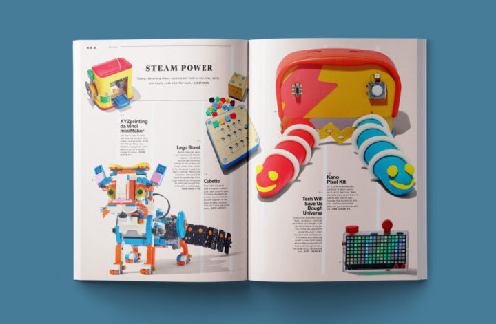
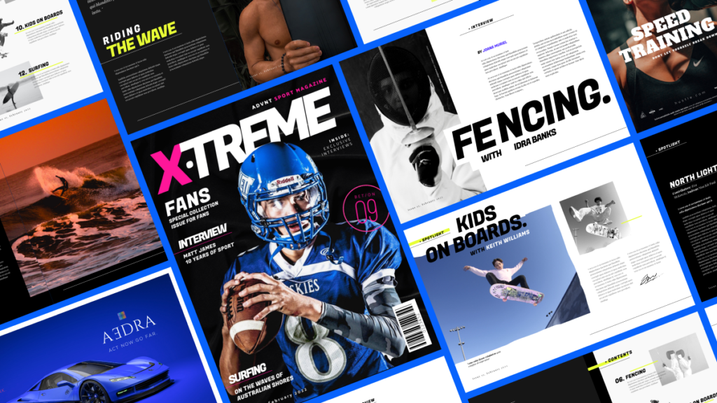
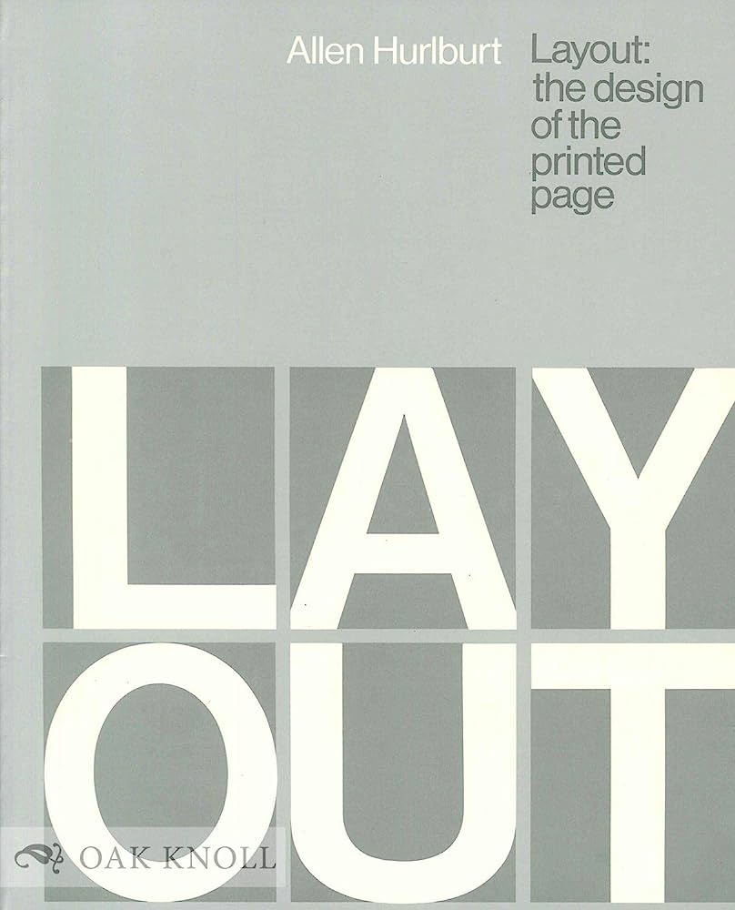
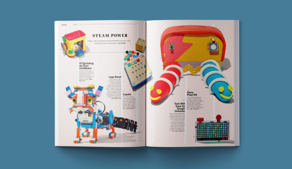
In the fast-paced world of advertising and marketing, it’s crucial to capture the attention of consumers quickly and effectively. This is where the power of typography comes into play. Typography, the art and technique of arranging type, can set the mood, tone, and urgency of a message. The right choice of fonts, letter spacing, and even the use of bold letters can evoke different emotions and create a lasting impression.
With customers being bombarded with information from all angles, excellent typography can be a competitive advantage. It can make an advertisement stand out amidst the noise and draw the viewer’s attention in. By crafting the typography carefully, marketers can influence the way in which their message is perceived and remembered.
In the next section, we will delve deeper into the elements of typography that can make or break an advertising campaign. From the choice of typefaces to the spacing between lines, every design element contributes to the overall effectiveness of the marketing material. But before we do that, let’s explore the significance of typography in advertising and marketing processes.
The Impact of Typography in Advertising and Marketing
Typography plays a crucial role in the success of advertising and marketing campaigns. With consumers often overwhelmed by an abundance of information and advertising messages, the power of typography lies in its ability to capture attention and create a lasting impact. Effective typography has the potential to shape the user experience, evoke emotions, and effectively communicate a brand’s message. By understanding the nuances of typography and using it strategically, marketers can enhance the visual appeal of their advertising materials, establish a strong brand identity, and ultimately increase conversion rates. In this article, we will explore the various ways in which typography influences advertising and marketing, from the choice of fonts to the executional elements that contribute to overall success.
1. Typography and Brand Identity:
Typography plays a significant role in establishing and reinforcing a brand’s identity. Choosing the right typeface design and style can evoke specific associations with a brand’s values or personality. Whether it’s a serif font for a traditional and sophisticated image or a sans-serif font for a modern and minimalistic feel, the correct typeface can create a strong visual identity that consumers will instantly recognize.
2. Typography and Visual Hierarchy:
In advertising and marketing, visual hierarchy is crucial for conveying information effectively. Typography helps in creating visual hierarchy by using different levels of font size, boldness, and letter spacing. Through typographic hierarchy, marketers can guide the viewer’s eye to the most important elements of the advertisement or marketing collateral, ensuring that the key message is seen and understood.
3. Typography and User Experience:
Typography also plays a vital role in enhancing the user experience. Proper letter spacing, line spacing, and the use of white space can greatly impact the readability and legibility of the text. By prioritizing readability, marketers can improve the overall user experience, reduce bounce rates, and keep consumers engaged with the advertising material.
4. Typography and Emotional Response:
Designing and typography have the power to evoke emotions and influence consumers’ attitudes towards ads. The choice of font and design elements can elicit different emotional responses from viewers. For example, a bold and uppercase lettering may convey a sense of confidence and assertiveness, while a script font may project elegance and sophistication. Understanding the impact of typefaces on emotional responses allows marketers to craft their advertising messages in a way that resonates with their target audience.

Conclusion
In conclusion, typography is one of the most powerful tools available to marketers and advertisers. By leveraging the various elements of typography, marketers can create a strong visual identity, improve user experience, and evoke emotional responses from their target audience. As such, it is essential for marketers to understand the nuances of typography and use it strategically in their advertising campaigns.

