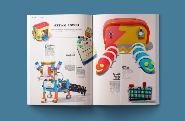
In today’s digital age, where most marketing efforts take place online, it’s easy to forget the power of print. However, for freelancers and businesses alike, having clean and professional printed assets is crucial for making a strong first impression. Whether it’s business cards, brochures, or posters, a well-designed print layout can speak volumes about your brand and credibility.
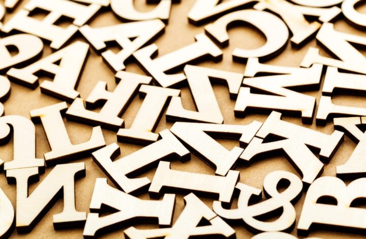
To create an effective print layout, there are a few key tips to keep in mind. Firstly, simplicity is key. Minimalistic design elements and a clean layout can ensure that your message is easily conveyed and doesn’t overwhelm the viewer. Additionally, using high-quality fonts and images is essential to portray professionalism and attention to detail. Remember that your print assets will be physically held and examined, so investing in high-resolution images and crisp fonts is a must.
In this article, we will delve into five essential tips for creating an effective print layout that captures your target audience’s attention and makes a lasting impact. So, let’s dive in and explore how you can craft eye-catching print materials that leave a positive and memorable impression.
Tip 1 – Business Cards
Business cards play a crucial role in print design and are essential for promoting brand recognition and recall. These small but impactful print assets provide a tangible representation of your business and serve as a powerful marketing tool.
A well-designed business card includes key components such as your logo, contact information, and branding elements, all of which contribute to brand identity. The logo represents your business visually, helping to establish immediate brand recognition. Contact information allows potential customers to easily reach out to you, increasing the chances of communication and potential future business.
Moreover, business cards make a lasting first impression, presenting an opportunity to connect with potential customers on a personal level. By carefully choosing the design elements and color scheme that align with your brand, you can evoke a sense of professionalism and credibility. The strategic placement of branding elements reinforces brand recall, making it more likely that customers will remember your business when in need of your products or services.
Tip 2 – White Space and Negative Space
One of the most effective ways to create an impactful print layout is by utilizing white space and negative space. White space refers to the unused or empty areas in a design, while negative space refers to the space between and around the design elements. Incorporating these design techniques can greatly enhance the overall clarity, readability, and visual appeal of your print materials.
The benefits of using white space and negative space in your print layouts are numerous. Firstly, white space creates a sense of balance and allows the important elements of your design to stand out. When used strategically, it can draw attention to key information, guiding the reader’s eye and preventing visual clutter. By giving your design room to breathe, you create a sense of elegance and sophistication.
Properly utilizing white space can also improve readability. Ample space between lines of text and paragraphs makes it easier for readers to navigate through the content and absorb the information. It prevents the text from feeling cramped and overwhelming, making it more likely that readers will engage with your message.
Furthermore, white space and negative space contribute to the overall visual appeal of your print layouts. They create a sense of balance and harmony, making the design more pleasing to the eye. The use of white space can also evoke a sense of minimalism and modernity, giving your print materials a more contemporary and sophisticated look.
It’s important to differentiate between active white space and passive white space. Active white space is intentionally incorporated to highlight specific design elements or create visual interest. For example, using white space to separate a headline from the body text or to draw attention to a call-to-action. Passive white space, on the other hand, is the unintentional white space that naturally occurs within the design. Both types of white space can be strategically used to enhance the overall impact of your print layouts.
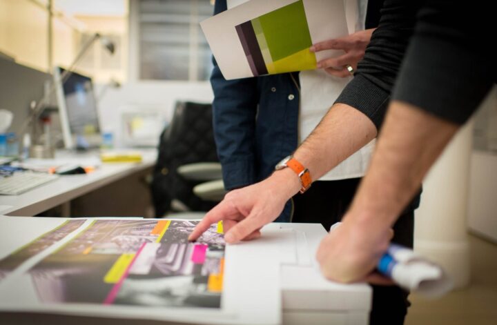
Tip 3 – Graphic Designer’s Toolbox
Every graphic designer should have a well-equipped toolbox to create effective print layouts. Here are some essential tools and resources:
- High-Quality Images: Using high-quality images can make a significant difference in the overall impact of your print layout. These images, whether photographs or illustrations, should be clear, sharp, and visually appealing. High-resolution images ensure that the details are crisp and vibrant, enhancing the visual experience for your audience.
- Vector Images: Incorporating vector images in your print layouts provides several advantages. Vector images are scalable without losing quality, making them ideal for resizing or printing in different sizes. They are also editable, allowing designers to easily modify colors, shapes, and other elements, ensuring flexibility and creativity in the design process.
- Realistic Images: Realistic images, such as product photographs or lifestyle shots, can create an emotional connection with your target audience. By presenting them with relatable visuals, you can evoke a desired emotional response, influencing their perception and encouraging engagement with your print materials.
- Image Resolution: To ensure print quality, it is crucial to use images with a high resolution—typically, 300 dots per inch (DPI). This resolution ensures that your images appear sharp and detailed when printed, avoiding any pixelation or fuzziness that could detract from the overall effectiveness of your print layout.
- Colored or Light Backgrounds: Choosing the right background for your print layout is essential. Colored backgrounds can add vibrancy and impact, especially when selected thoughtfully to complement your design elements. On the other hand, light backgrounds can create a clean and sophisticated look, allowing the other design elements to stand out and grab attention.
A graphic designer’s toolbox should include high-quality images, vector images, realistic images, and knowledge about image resolution. Additionally, understanding the impact of colored or light backgrounds can help you create visually appealing and effective print layouts.
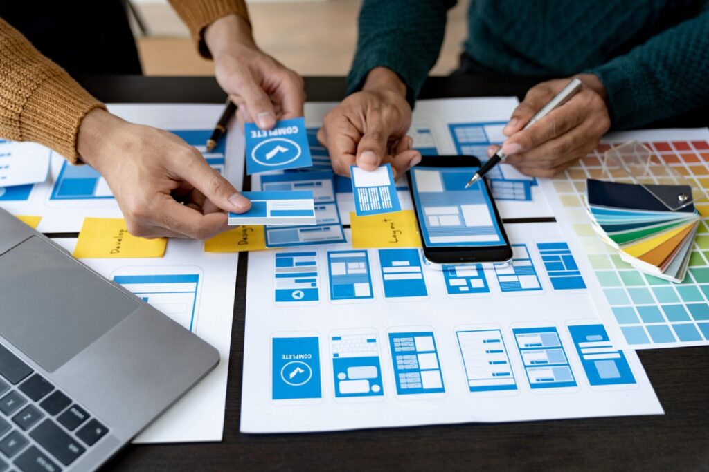
Tip 4 – Targeting Your Audience With Attractive Ads
When creating print ads, it is crucial to effectively target your audience with attractive designs. Understanding your target audience’s preferences and demographics is key to creating ads that resonate with them and evoke an emotional response. Here are some tips to achieve this:
- Know Your Target Audience: Before designing your print ad, research and analyze your target audience. Understand their demographics, interests, and preferences. This will help you tailor your design to their specific needs and desires.
- Create an Emotional Connection: A successful print ad elicits an emotional response from the audience. Use imagery, colors, and fonts that align with the emotions you want to evoke. Whether it’s happiness, excitement, or nostalgia, capturing the right emotion will make your ad more appealing and memorable.
- Use High-Quality Images: Incorporating high-quality images in your print ads is essential. Clear, sharp, and visually stunning images grab attention and effectively communicate your message. Avoid using generic stock photos and opt for unique, authentic visuals that align with your brand and resonate with your audience.
- Craft Compelling Headlines: The headline is the first thing your audience reads, so make it compelling. Create a strong headline that captures attention, piques curiosity, and communicates the value of your product or service. Keep it concise and impactful to entice your audience to read more.
Effective print ads target the intended audience with attractive designs, evoke emotions, and capture attention with high-quality images and compelling headlines. By following these tips, you can create print ads that effectively engage and resonate with your target audience.
Tip 5 – Color Scheme and Fonts
Choosing the right colors and fonts is crucial in creating an effective print layout. Appropriate colors and font styles help convey your message, evoke emotions, and attract specific target audiences. Here’s why it matters:
Colors have the power to elicit emotions and influence perceptions. For example, warm colors like red and orange can create a sense of excitement and urgency, making them suitable for promotions and sales. Cool colors like blue and green, on the other hand, can instill a sense of calm and trust, making them ideal for professional services.
Using complementing and contrasting color combinations can make your print ads visually appealing. Complementary colors are opposite to each other on the color wheel (e.g. blue and orange), creating a vibrant and harmonious effect. Contrasting colors, such as black and white, or yellow and purple, create visual interest and catch the viewer’s attention.
Experimenting with monochrome color schemes can also have a dramatic impact. Monochrome involves using different shades, tints, and tones of a single color. This creates a sleek and sophisticated look that can be used to convey elegance or simplicity.
Fonts play a significant role in print layouts. Choosing the right font style, size, and weight can enhance readability and convey the tone of your message. For instance, a bold and sans-serif font may be suitable for headlines, while a clean and easy-to-read font is better for body text.

Conclusion
In conclusion, creating an effective print layout requires careful consideration of the elements of design. Pay attention to the hierarchy of information, create a visually appealing design, and use typography to complement the overall composition. Also, remember to take into account any printing restrictions or guidelines that may apply. With these tips in mind, you should be well on your way to creating an effective print layout that will engage your audience and help to convey your message.