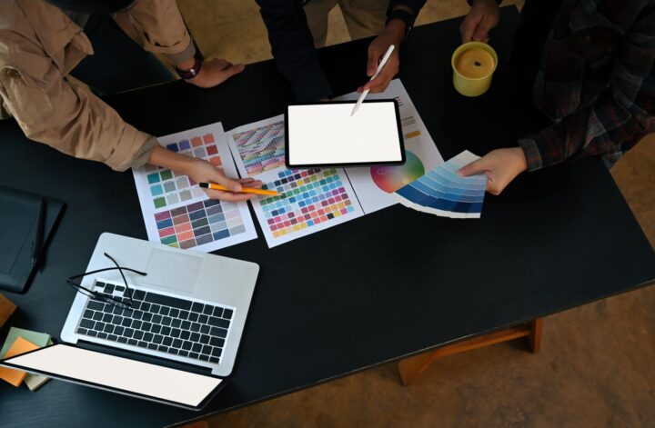
Unlock the power of color and tap into the psychology of design. In the world of graphic design, understanding the psychological impact of color is essential for creating successful and engaging designs. Colors have the ability to evoke emotions, stimulate the senses, and even influence behavior. By strategically selecting and incorporating different colors into your designs, you can communicate emotions, convey messages, and create a memorable user experience. Warm colors like reds and oranges can create a sense of urgency or excitement, while cool colors like blues and greens can evoke feelings of calmness or tranquility.
Additionally, neutral colors provide a versatile backdrop that allows other colors to take center stage. By harnessing the psychology of color, graphic designers have a powerful tool to captivate audiences and make a lasting impact. So next time you embark on a design project, remember that the colors you choose can speak volumes and evoke emotions that can ultimately resonate with your target audience.
What is Color Psychology?
Color psychology studies the impact of colors on our thoughts, emotions, and behaviors, including innate responses and cultural influences. Researchers in this field explore the associations we have with specific colors, both on a primal level and as influenced by our cultural backgrounds.
Colors have a powerful effect on our psyche, often evoking certain feelings or moods. For example, warm colors like red and orange can stimulate feelings of excitement and passion, while cool colors like blue and green tend to be more calming and soothing.
Understanding color psychology can be particularly important in graphic design, as the colors used in a design can have a significant impact on how it is perceived. Color choices can evoke a sense of urgency, create a mood, or even influence our preferences and biases.
When considering color psychology in graphic design, it is important to take into account factors such as cultural meanings and personal experiences that may influence individual reactions to specific colors. By carefully selecting and combining colors in a design, graphic designers can create a visual language and evoke specific emotional responses from viewers.
The Role of Color in Graphic Design
Color is an important element in graphic design as it has the power to engage an audience, convey messages, evoke emotions, create moods, and influence perceptions.
By carefully selecting and using colors, designers can tap into the psychological impact of color to enhance their designs. For example, vibrant and bold colors like reds and yellows can evoke excitement and energy, making them perfect for designs that aim to capture attention or create a sense of urgency. On the other hand, soft and pastel colors like blues and pinks can convey a sense of calmness and serenity, making them ideal for designs that aim to evoke relaxation or a soothing atmosphere.
In addition to evoking emotions and creating moods, colors are used selectively to achieve harmony, balance, and consistency in graphic designs. Designers often establish a color palette or scheme to ensure that colors work together seamlessly and complement each other. This careful color selection helps to create a cohesive visual experience and convey a specific message.
Benefits of Using Color Psychology in Graphic Design
Incorporating color psychology into graphic design offers numerous benefits that can greatly enhance the effectiveness of visual communication and impact consumer behavior. By understanding and leveraging the emotional response that certain colors evoke, designers can create a powerful connection with their audience.
Colors have the ability to evoke specific emotions, and this can be effectively utilized in graphic design. For example, warm colors like red and yellow can evoke feelings of excitement and energy, making them ideal for designs that aim to grab attention or create a sense of urgency. On the other hand, cool colors like blue and green can convey a sense of calmness and serenity, perfect for designs that aim to evoke relaxation or a soothing atmosphere.
Moreover, the selection of the right color palette is crucial in conveying the intended message to the target audience. Designers carefully choose a harmonious combination of colors that work together to create a cohesive visual experience. The right color palette can enhance brand recognition, establish a desired mood or tone, and even influence purchasing decisions.
Popular Colors and Their Meanings
Colors have the power to elicit emotions and set the mood in graphic design. Understanding the psychology behind popular colors can help designers choose the most suitable color to effectively convey a message.
- Red: Often associated with power, passion, and energy, red captures attention and evokes feelings of excitement. It can be used to create a sense of urgency or to stimulate appetite, making it a popular choice for food brands.
- Yellow: Symbolizing happiness, optimism, and warmth, yellow grabs attention and promotes a cheerful atmosphere. It is often used to convey positivity and can be seen in brands that want to radiate a friendly and inviting image.
- Orange: Combining the excitement of red and the cheerfulness of yellow, orange represents enthusiasm, creativity, and encouragement. It is commonly used to promote a sense of excitement or as a call to action in designs.
- Green: Signifying nature, growth, and freshness, green instills a sense of calmness and balance. It is frequently used in designs related to health, relaxation, and environmental causes.
- Blue: Associated with trust, stability, and serenity, blue induces a sense of calmness and reliability. It is often used in corporate branding and designs that aim to project professionalism and reliability.
By understanding the meanings behind these popular colors, designers can strategically use them to influence emotions, elicit desired moods, and effectively communicate messages to their target audience.

Conclusion
In conclusion, Understanding color psychology in graphic design is essential for designers to create specific effects on consumers by comprehending the emotions and moods that different colors evoke. Utilizing color psychology not only enhances the overall design, but it also enables designers to strategically choose the right colors to convey the desired message. Whether it’s using warm colors to create a sense of urgency or cool colors to induce a calm and trustworthy atmosphere, the power of color can greatly impact the success of a design. By harnessing the benefits of utilizing color psychology, designers can create visually appealing and emotionally engaging designs that leave a lasting impression on their target audience.


